DiDi Communication Design Systems
- Client
- DiDi
- Role
- Design Systems, Product Design, Brand, Illustration
- Year
- 2020-2022
I designed and led the implementation of two interconnected systems that standardized DiDi’s digital communications across 8 Latin American markets, improving brand consistency, production efficiency, and scalability.
Impact
- 8 markets
- 45% faster delivery
- 20% improvement in UX score
- 75% → 100% Design team NPS
Context and Problem
DiDi is a Chinese ride-hailing company expanding across Latin America, with communication needs that differed significantly from its home market.
The visual illustration system inherited from headquarters was too generic to build brand credibility in the region and didn’t address marketing communication needs.
With one design team in Mexico and another supporting eight Spanish-speaking markets, the lack of unified visual direction led to fragmented communications, longer production times, and an inconsistent regional brand presence.
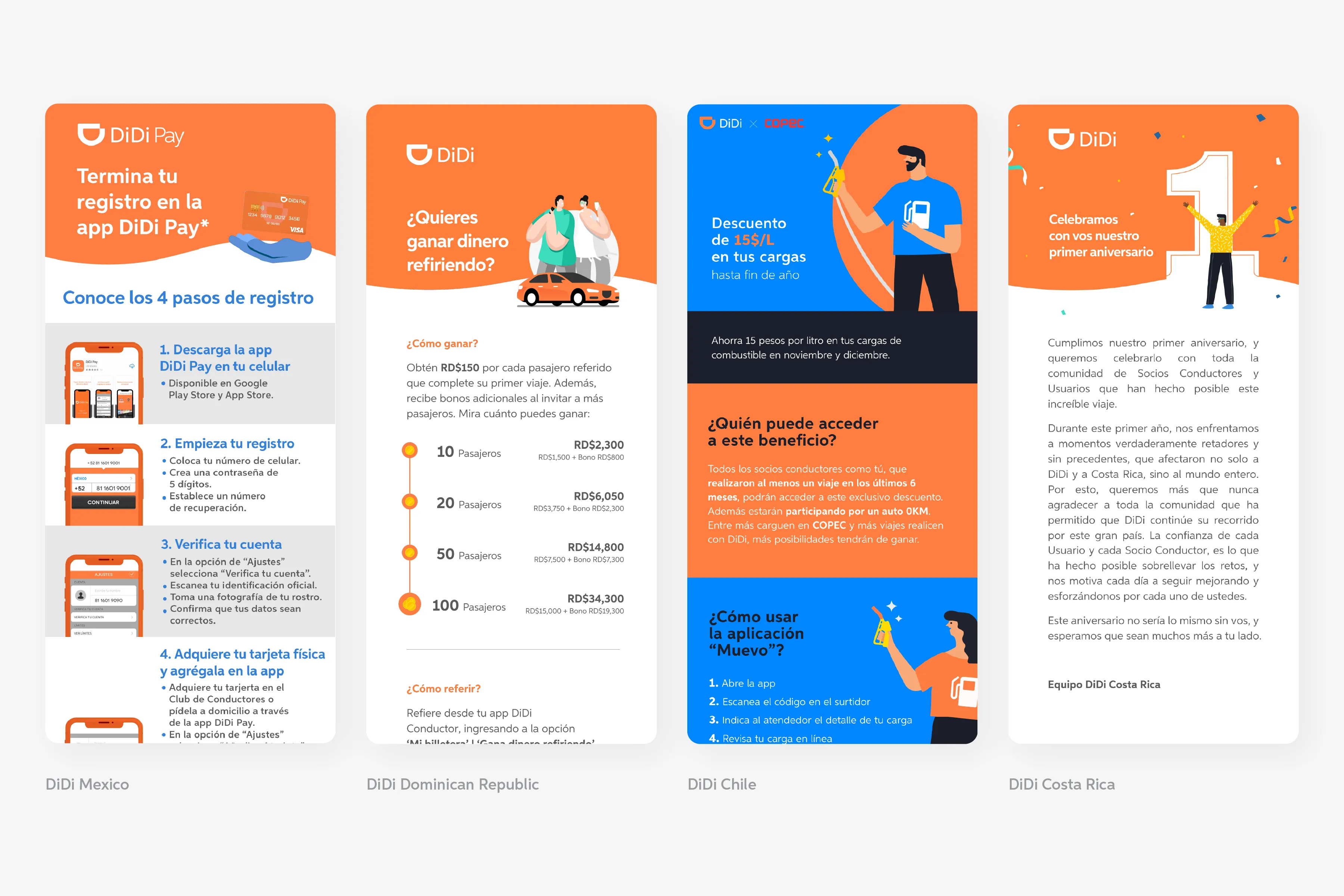
Solutions
The challenge was to build a scalable visual infrastructure that could adapt to regional needs within significant technical constraints. The solution was two interconnected systems:
- Illustration System: A modular visual library built for regional representation and recurring communication needs.
- Digital Communication Guidelines System: A standardized framework and reusable asset library designed to make communications faster and more consistent.
As the Digital Communications Sr. Designer for Latam, I led the design, implementation, and ongoing development of both systems.
01 - The Illustration System
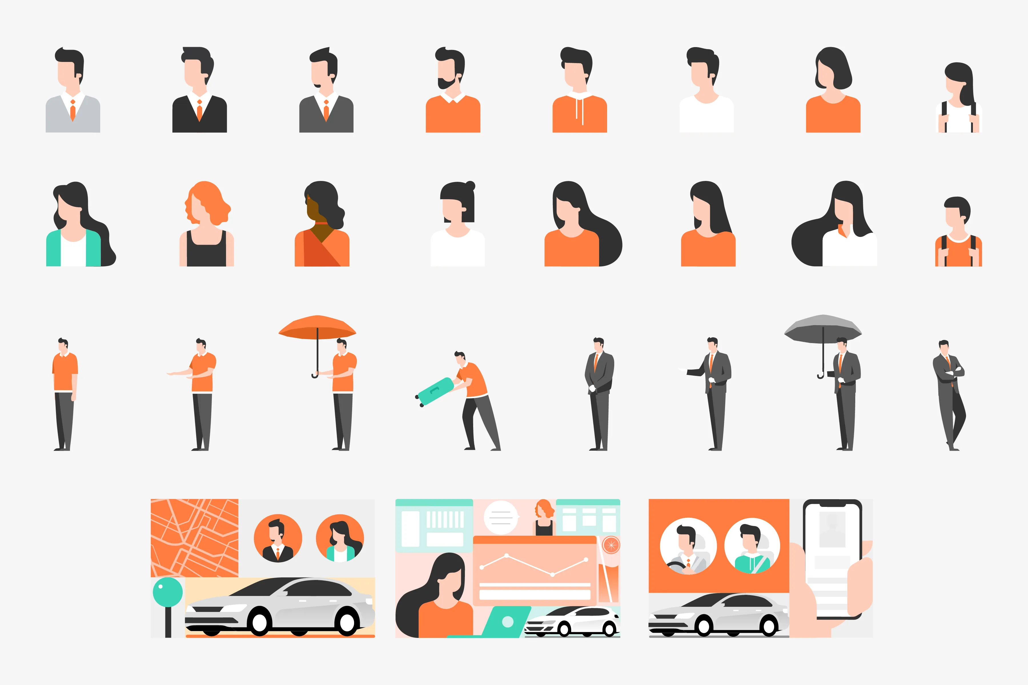
Built as a modular, vector-based system, the illustrations could quickly adapt to different themes, audiences, and contexts while keeping digital assets lightweight. The visual style evolved DiDi’s existing brand language rather than replacing it.
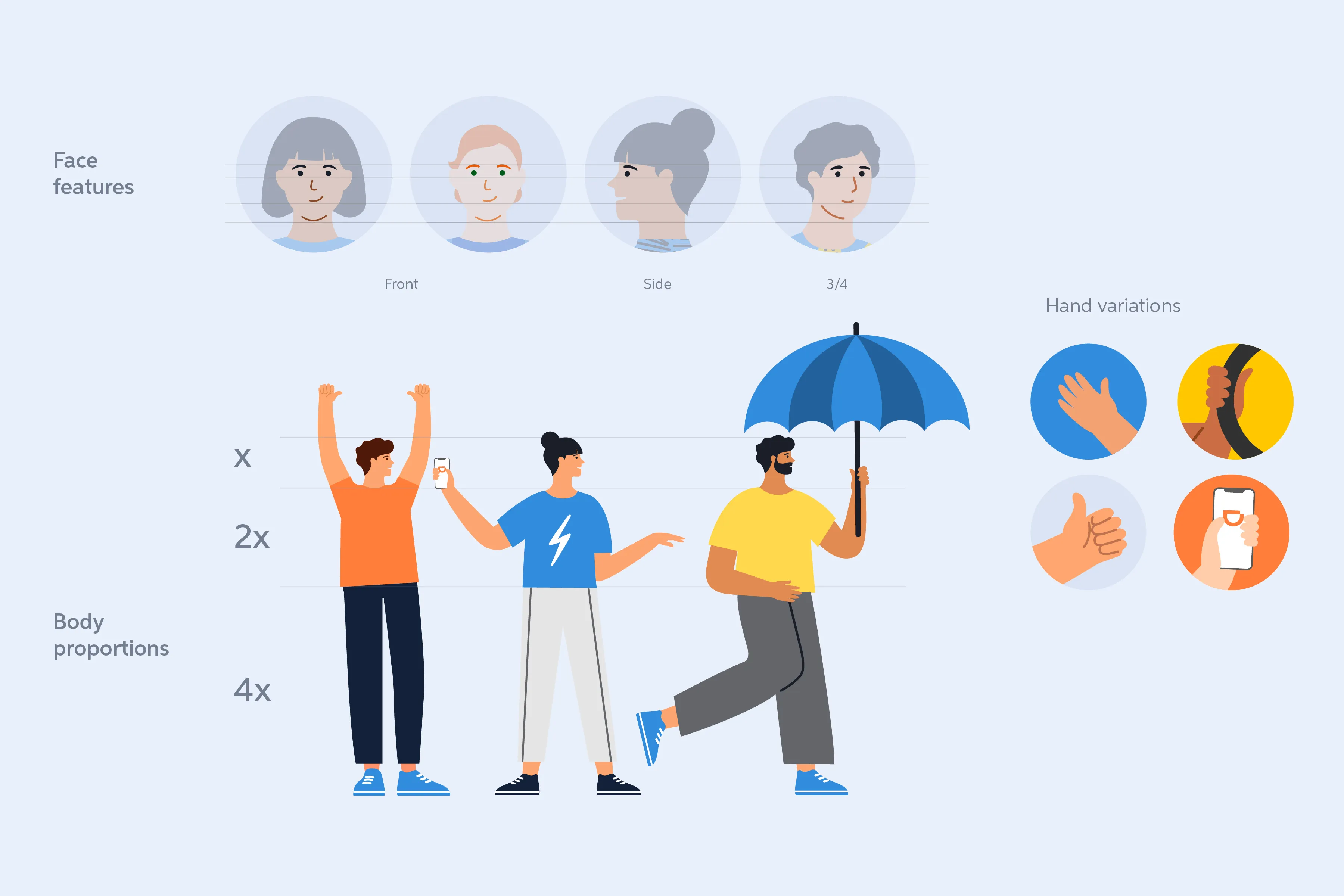

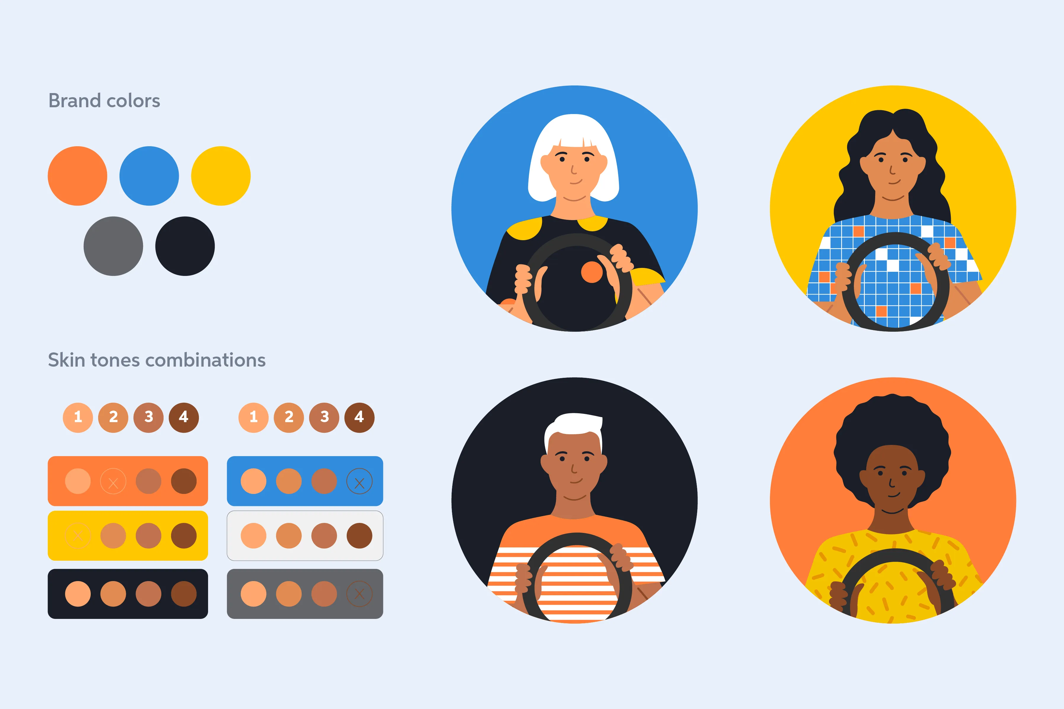
Designed Around Communication Needs
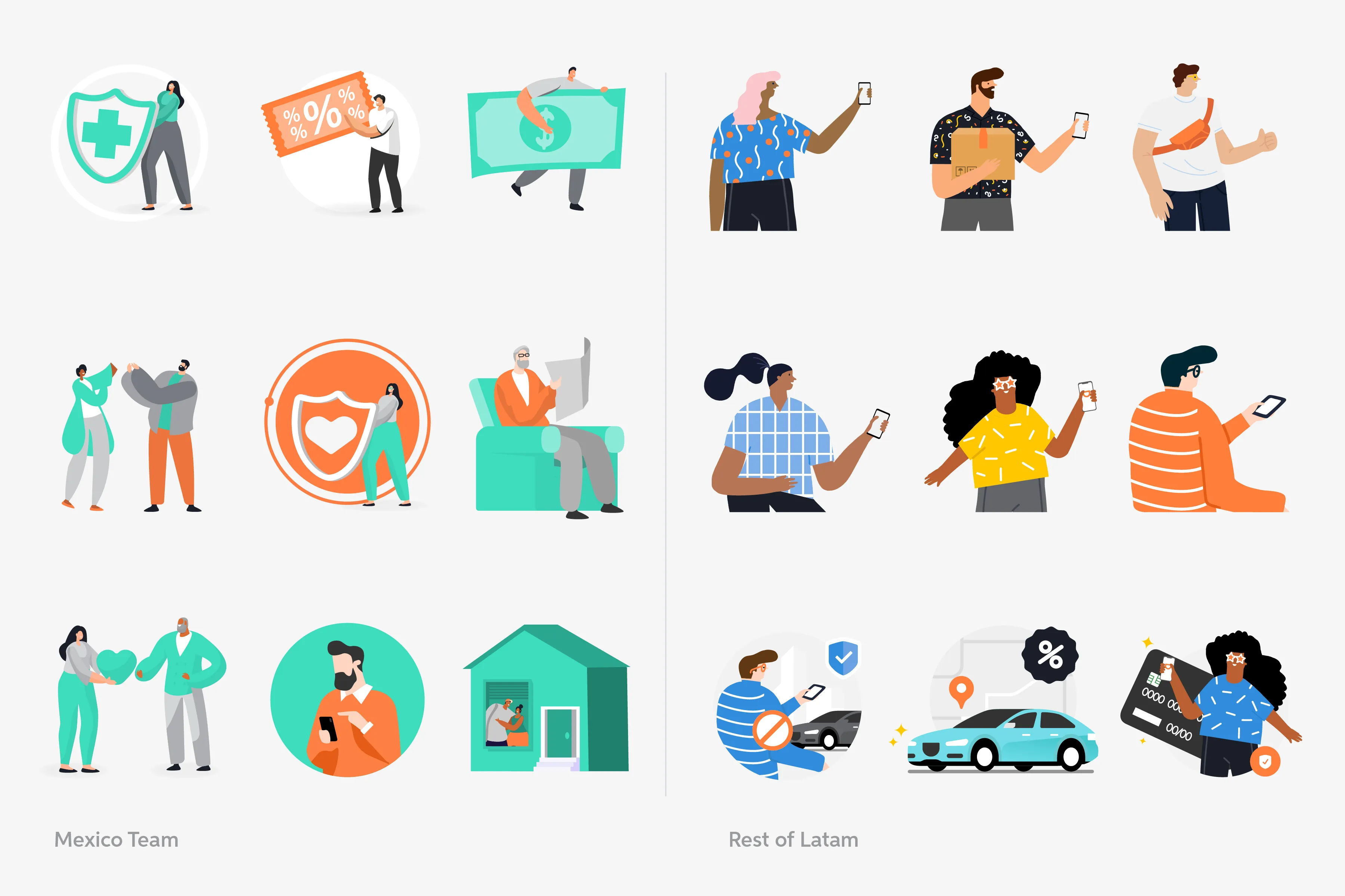
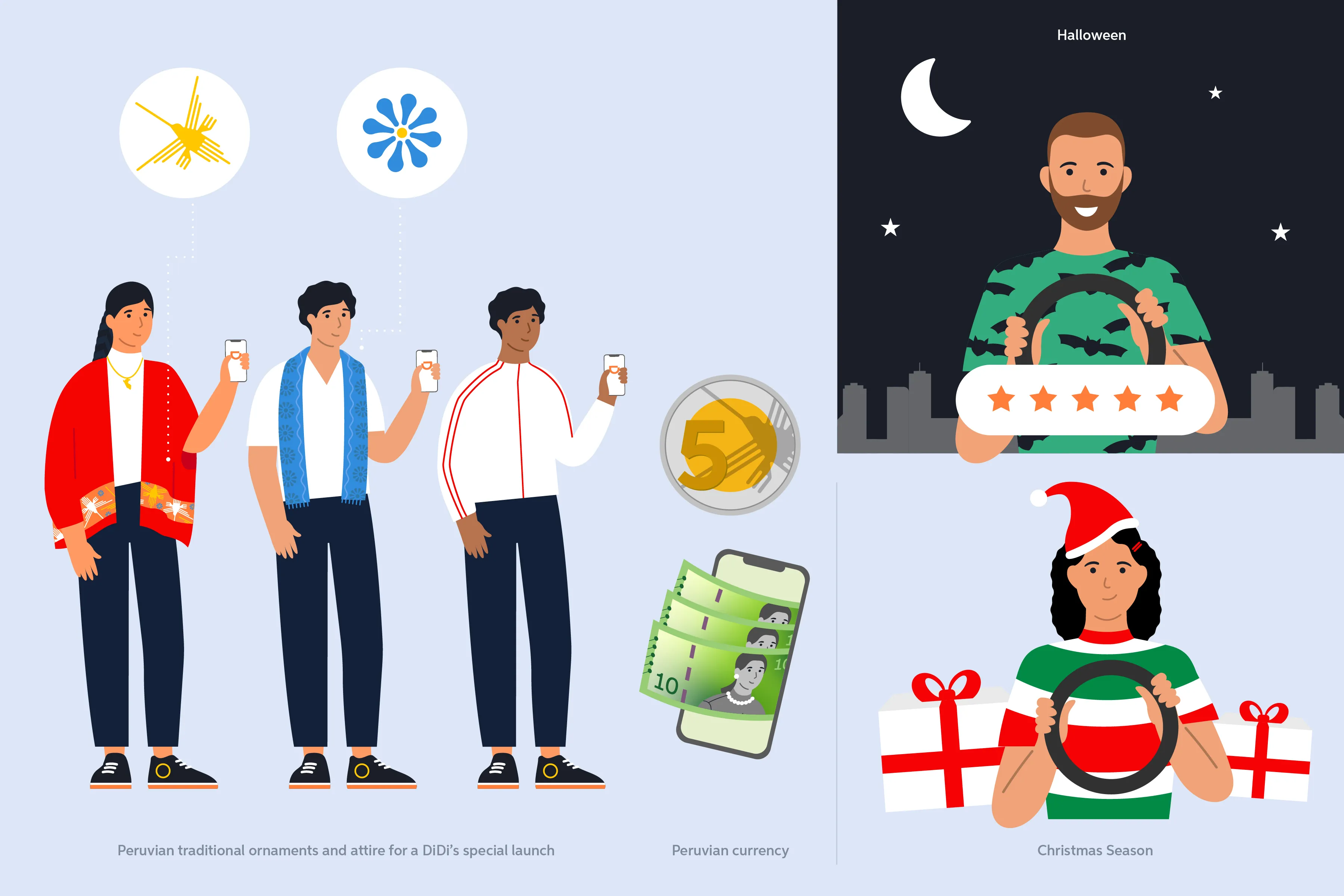

The inherited system lacked illustrations for recurring marketing needs such as discounts, safety features, and seasonal campaigns, as well as DiDi’s expanding services like motorcycle rides and food delivery. I designed the new library to support these evolving needs.
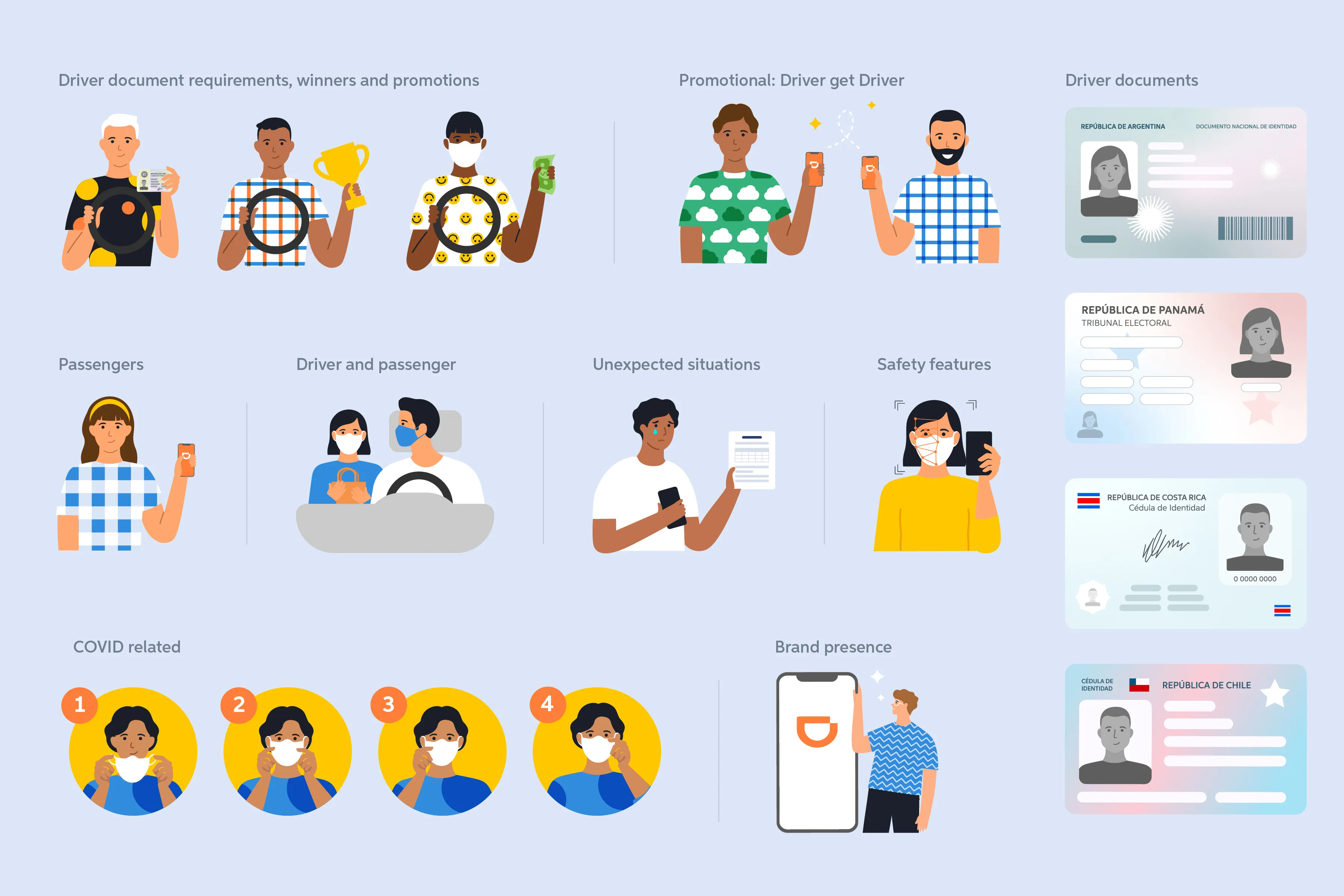


Regional Representation and Diversity
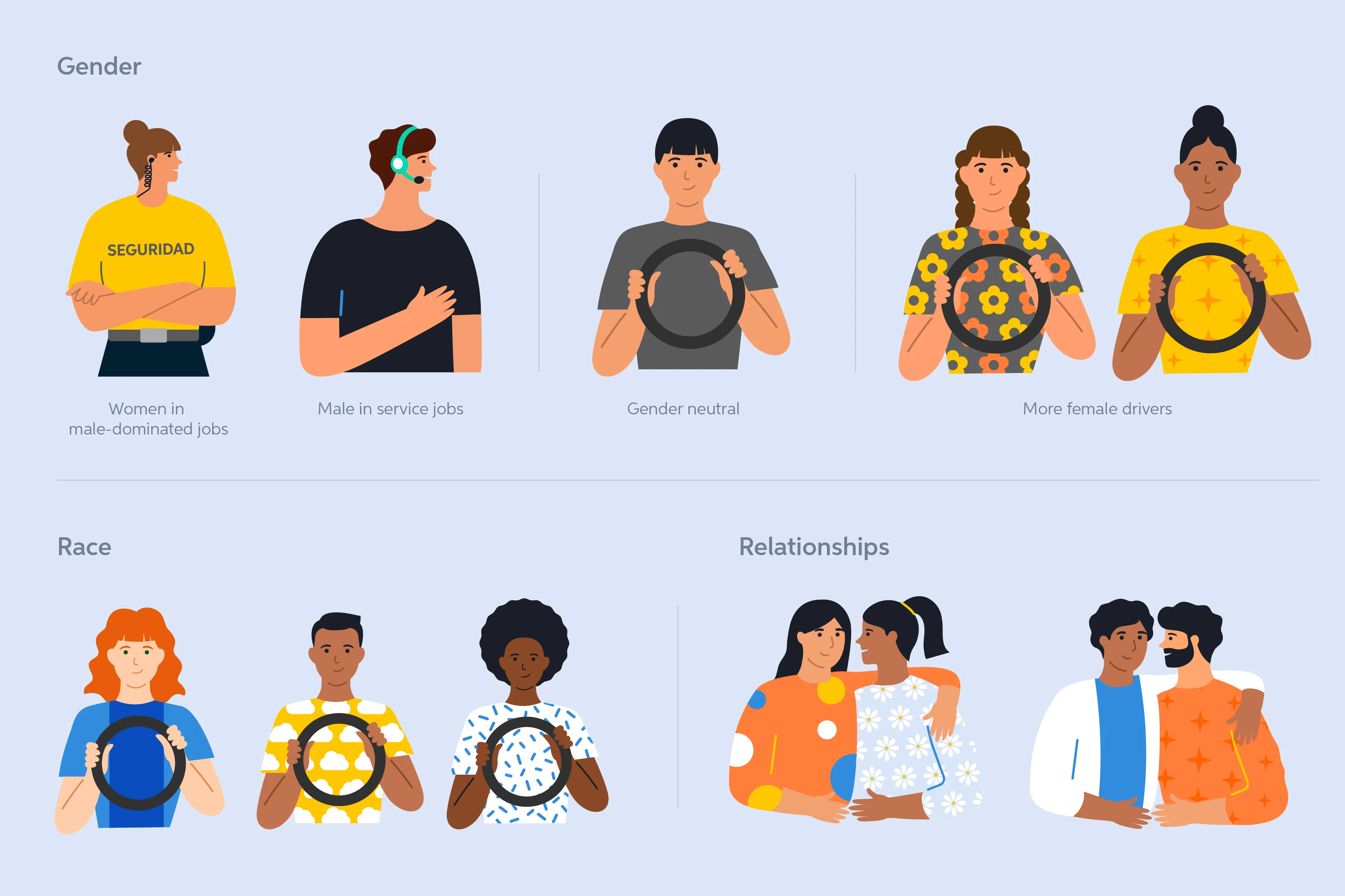
I designed the system to better represent the diversity of the region, focusing on gender, race, and relationships.
Built for Faster Production
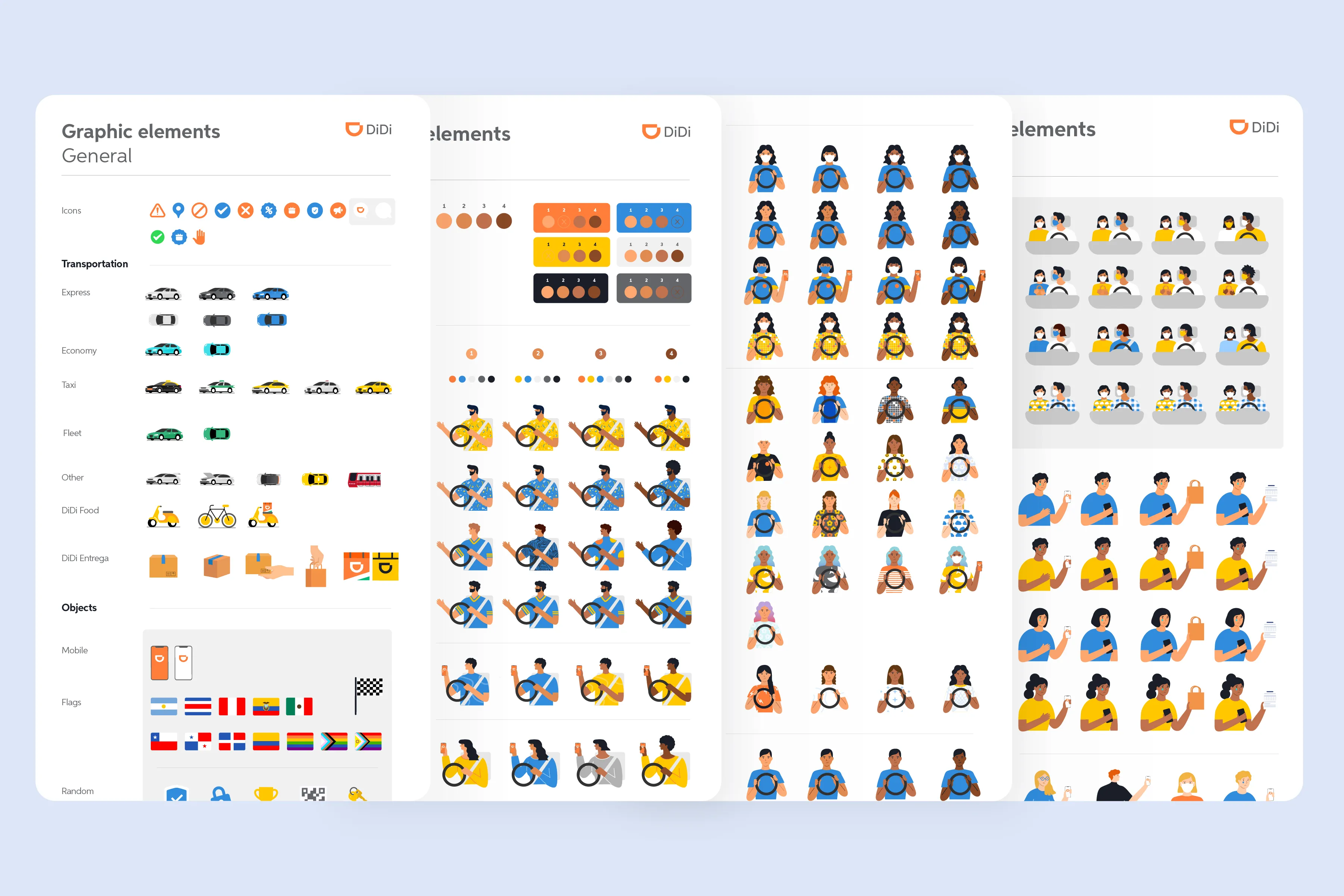
Designers could select and combine pre-built components from a centralized Illustrator library, while non-design teams accessed curated PNG assets through Confluence, reducing the need to create or request assets from scratch.
02 - Digital Communication Guidelines System
A reusable framework for producing consistent communications across markets, channels, and audiences. Designed for both drivers and passengers (with drivers representing approximately 75–80% of communication needs) the system prioritized accessibility and scalability within existing software and licensing constraints.
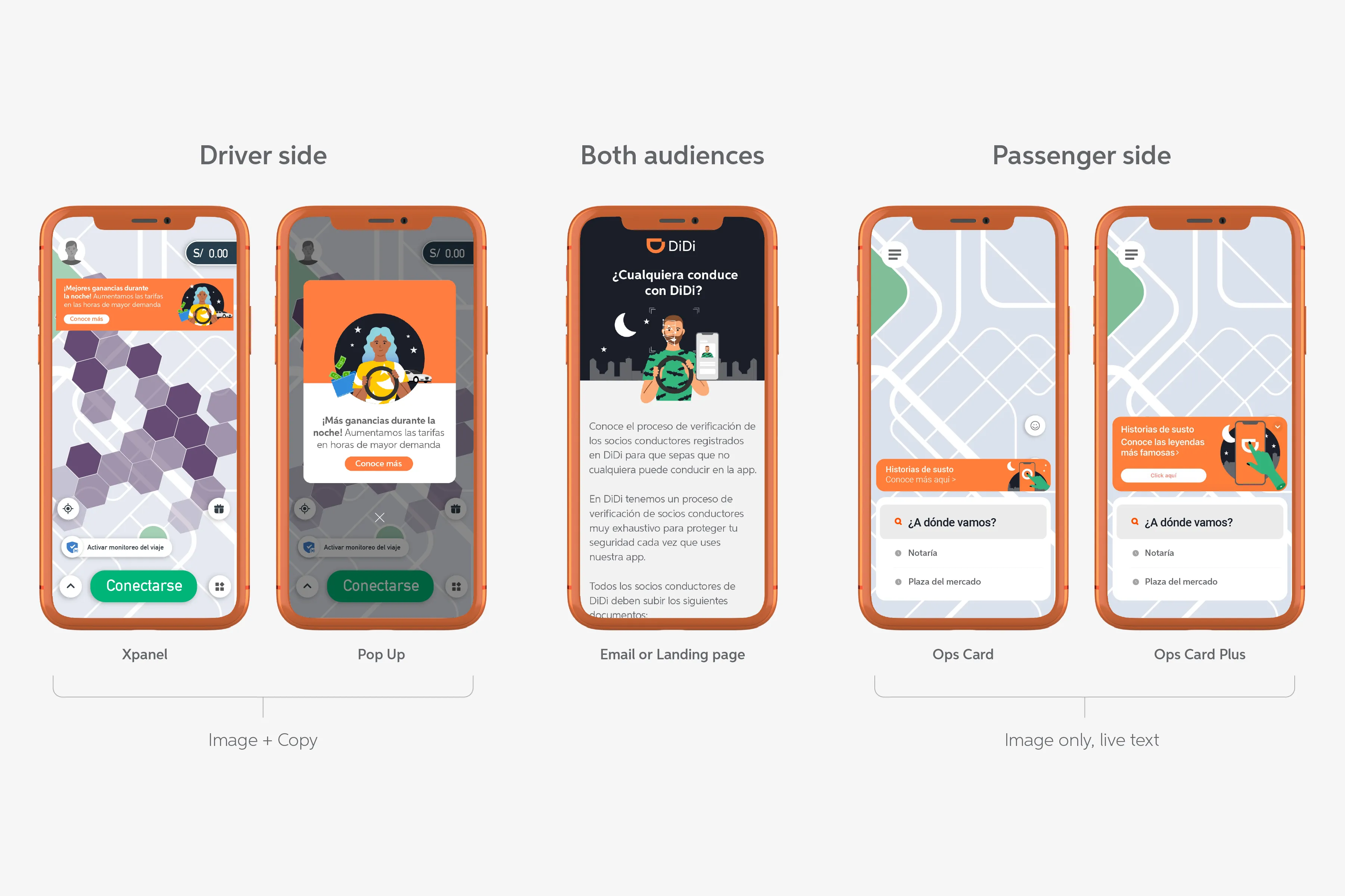
Design Decisions
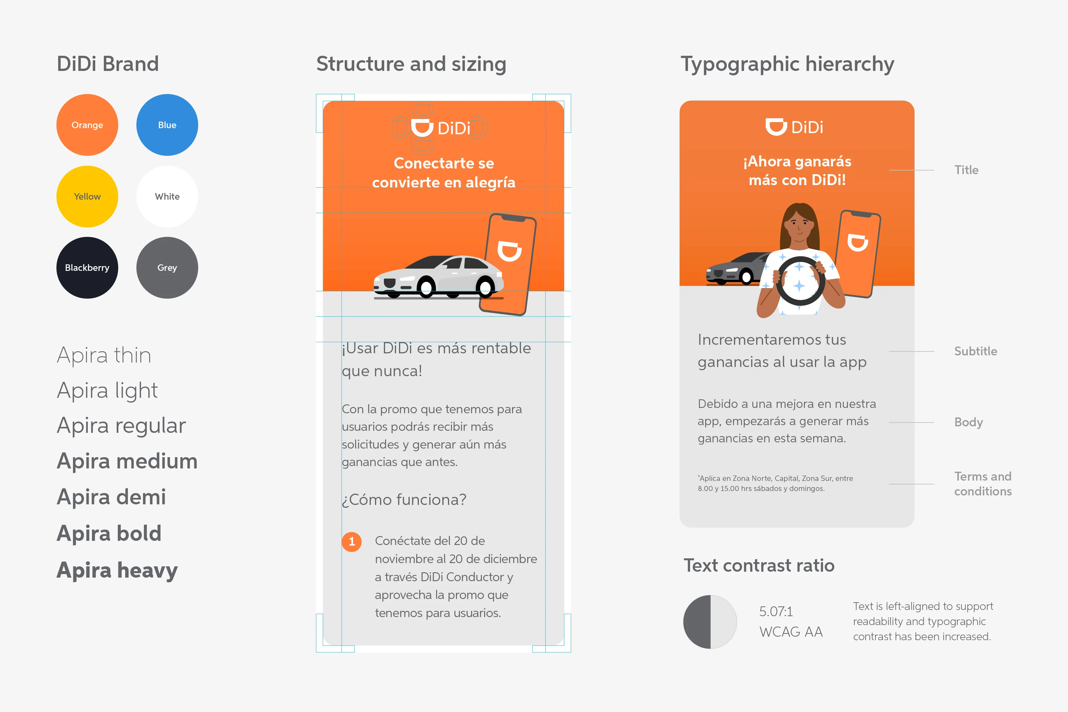
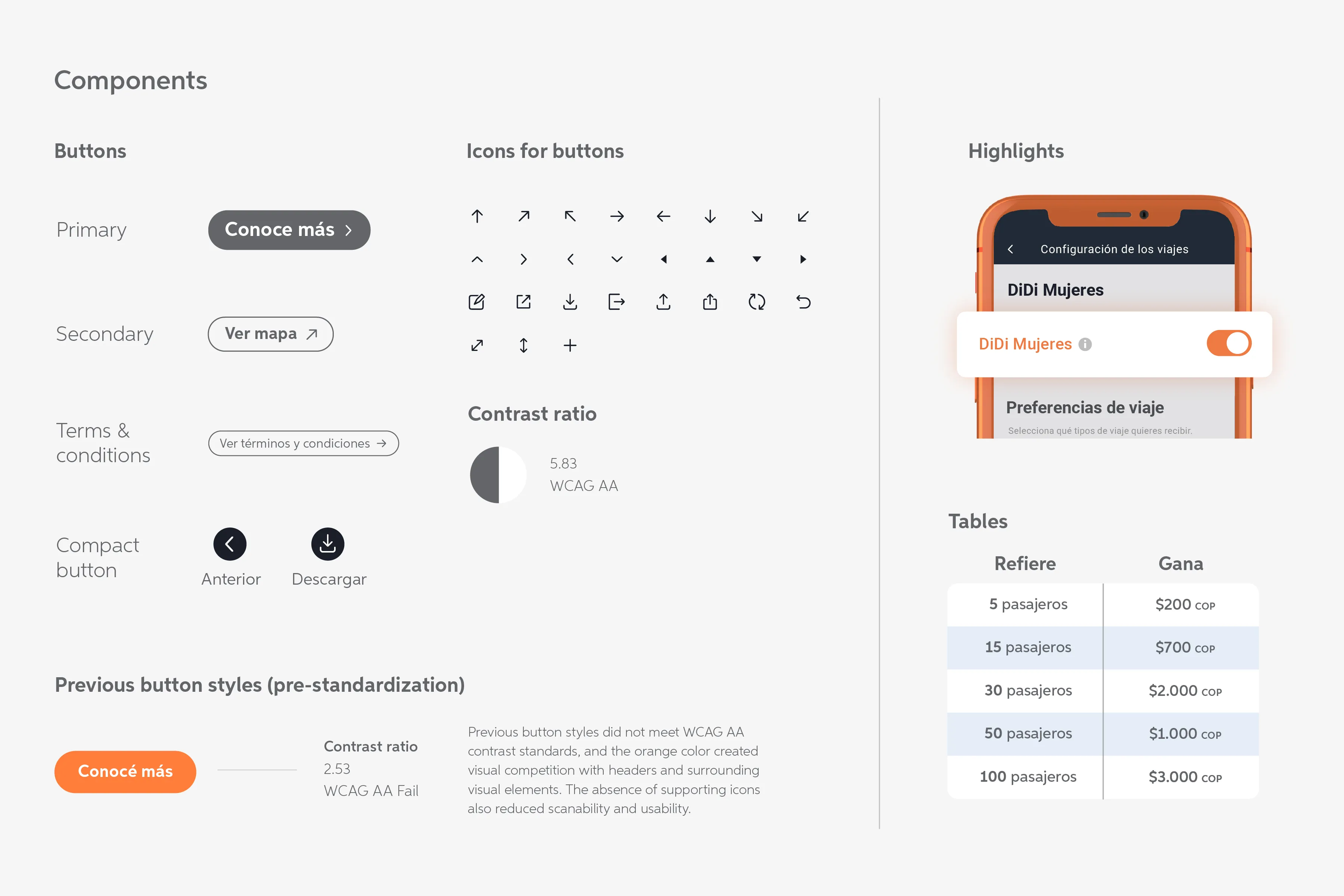
This wasn’t a rebrand; it extended DiDi’s existing identity into a scalable communication system. I identified recurring needs, such as tables, buttons, and icons, and turned them into reusable components and rules.
Built for Faster Production

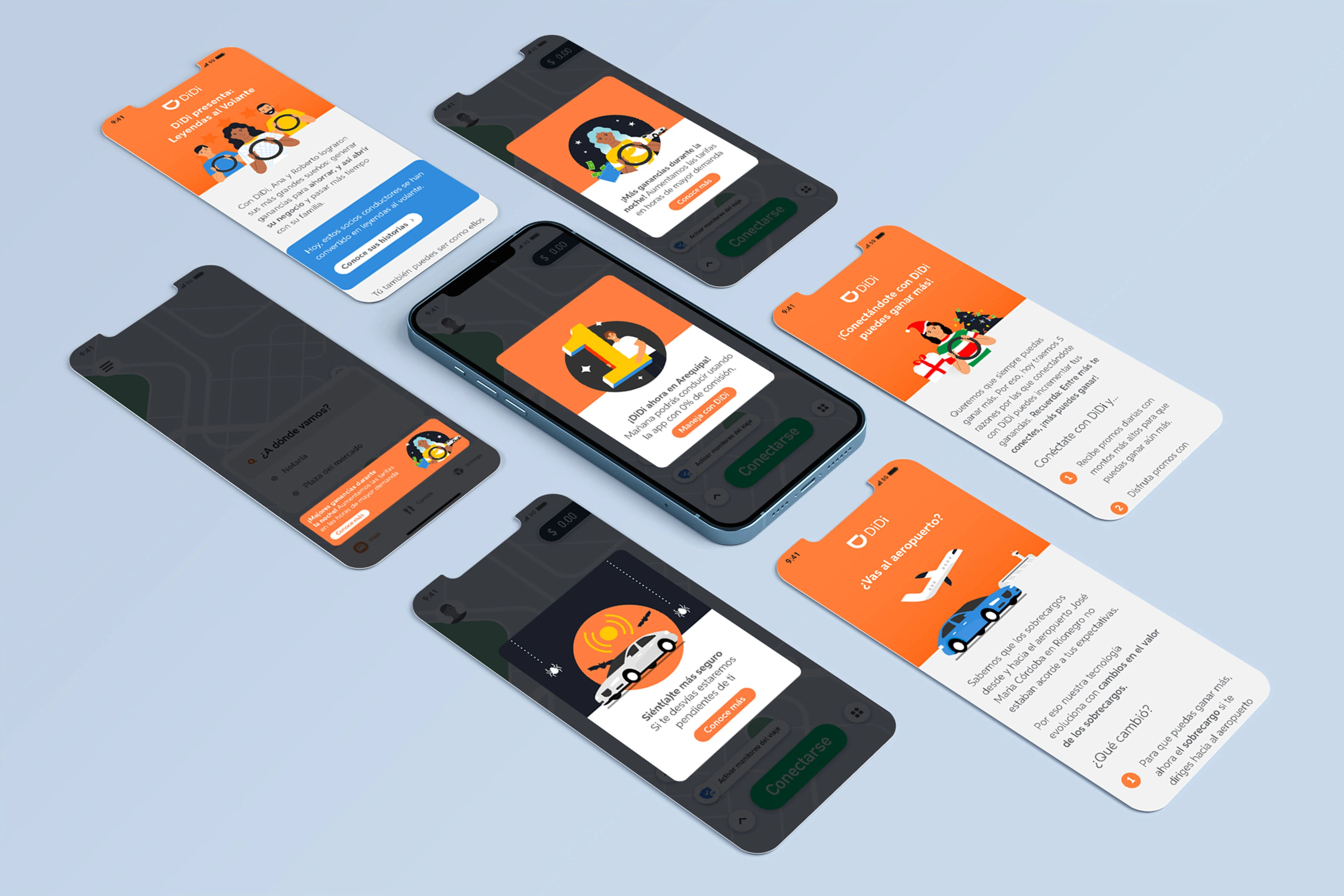
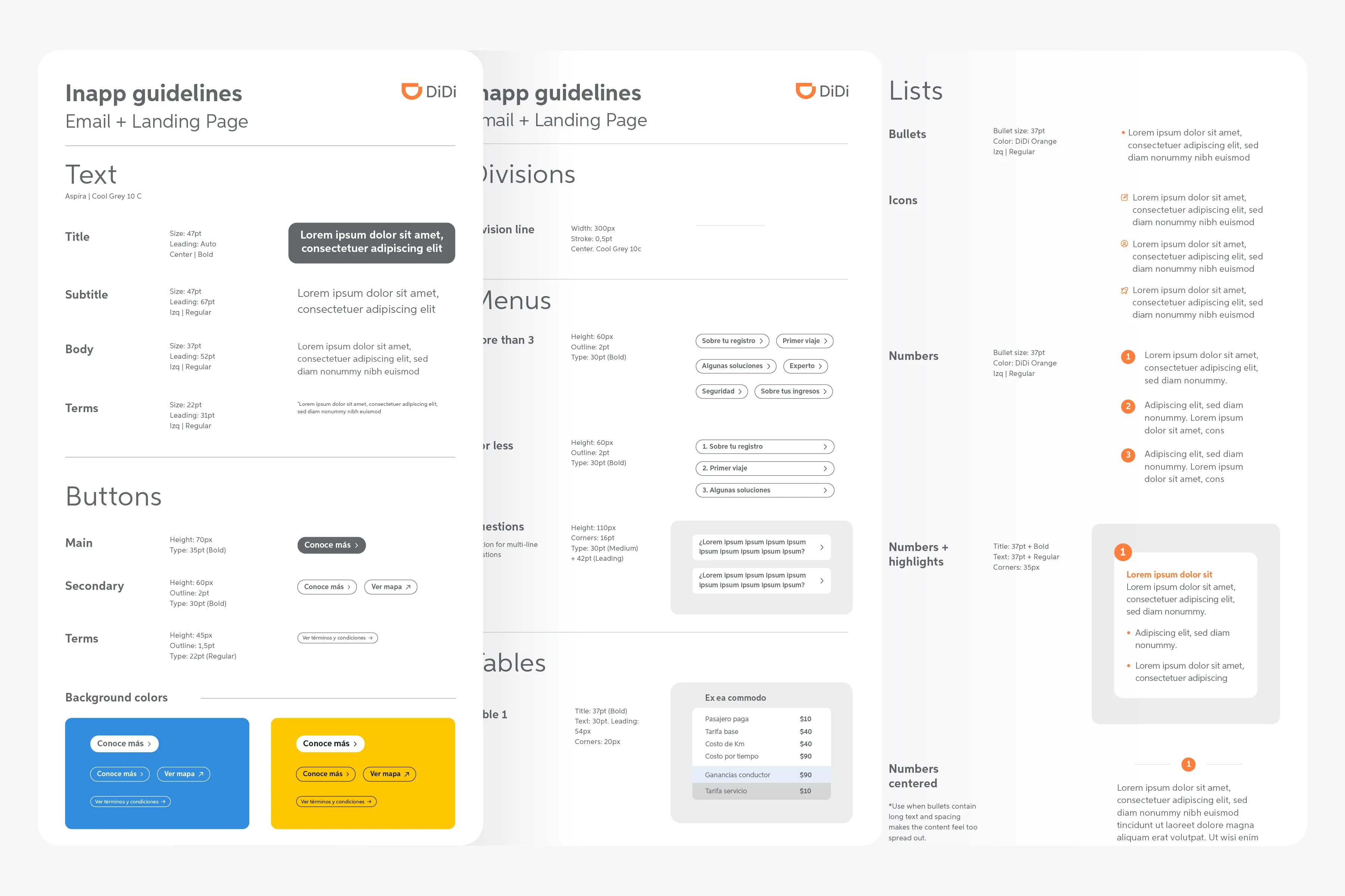
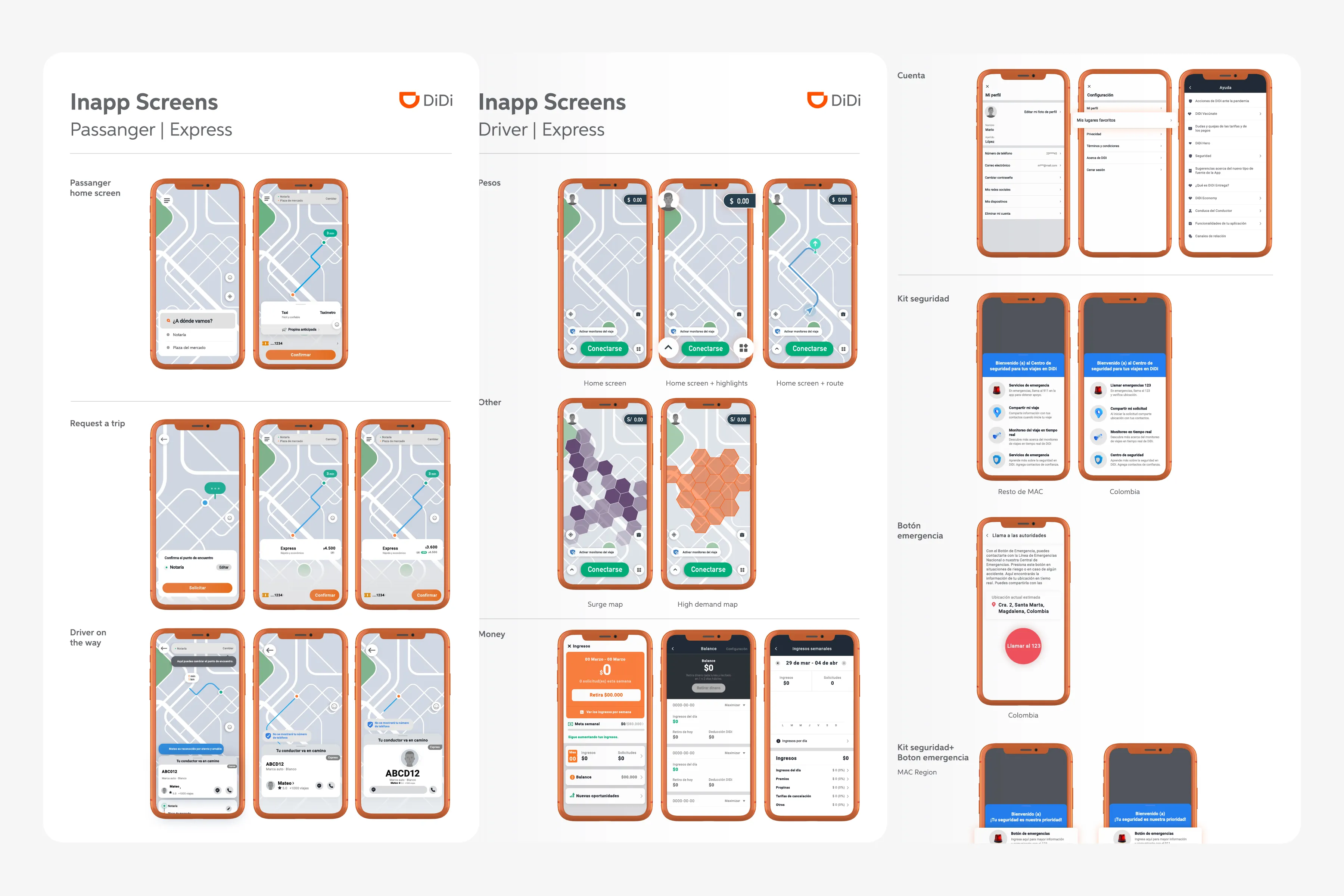
I created ready-to-use components, templates, and a UI gallery of frequently used app screens, allowing designers to quickly reuse and combine assets across communications.
Given software, licensing, and budget constraints, components were created in Adobe Illustrator and manually uploaded to an internal tool.
Testing
To validate the system, I worked with the Operations team to survey drivers, the primary audience, testing key elements such as phone sizing, legibility, and overall communication clarity.
I also conducted a heuristic evaluation based on usability best practices, comparing the previous and updated communications. Result: +20% improvement in overall UX score.
Impact of Both Systems
The two systems were adopted across the LATAM team in 8 countries: Dominican Republic, Panama, Costa Rica, Colombia, Ecuador, Peru, Chile, and Argentina, improving consistency and making digital communications faster and easier to produce.
- 45%
- Faster delivery
- +20%
- Overall UX score
- 75% → 100%
- Design team NPS